RK is my happy place. I work at it as much as I want to. My customers are the absolute best. I feel so lucky.
Last month I was invited to participate in a local maker’s market coming up in October. The show is juried and full of cool people who make beautiful things. The wheels started turning and suddenly I had a whole list of things to work out before I knit or crochet anything.
Marketing materials and banners are part of the market scene, so it was definitely time for a new outfit. Or, more to the point, it was time for a brand refresh. I had my work cut out for me.
Deciding to rebrand is a WHOLE HAIRY PROCESS, my friends.
I get locked in these ideas of what it SHOULD look like. My last logo was like that. I wanted something bohemian and flowy. It never felt right, though, and after unpacking my feelings about it for a year or so, I finally realized why. My personal style is neither bohemian nor flowy.
I had 1000 ideas, so I spent weeks poring over brand kits online. It took SO long and I almost scrapped the idea a dozen times. Then I found it (without my info on it, of course).
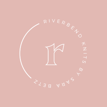
The bold, minimalist, open monogram at the top.
The balance of the three elements.
The mixed fonts.
*chef’s kiss*
After I broke up with what I thought it should be, it could be what I needed it to be. I had already picked my brand colors.
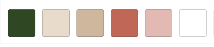
I love the palette’s whole vibe. The colors remind me of my teenage bedroom from the early ’90s. Dusty rose and forest green flowers on a cream wallpapered background lined my walls.
Here they are in action. I am SMITTEN!
I ADORE the logo in white on a colorful background.
I could wax poetic about the green one for days.
The others aren’t bad, either.

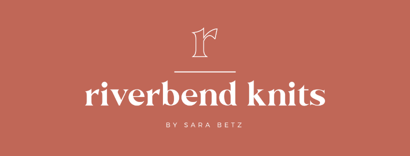

The logo also has MY NAME IN IT, which is something I never thought I would do. Seeing the template for this logo made me really consider it.
This decision was cemented a week or so ago when a customer I’ve known their whole life reached out to ask my shop’s FB page about custom work. It took a few exchanges to explain that Sara is RK and RK is Sara.
I took that as a sign.


I found Lindsey from Lulu’s Logo Shop on Etsy. Her premade branding kits took away the decision fatigue. She updated the logo she designed. I chose my colors and purchased the pieces I needed. The whole process took 48 hours. She’s fabulous. Look her up.
Watch for future posts about market prep, custom slots, and all of the shiny new things at RK.
